Most street-sign orders go wrong in the same quiet way: the buyer picks a size that looks right on screen, approves the art, and only later learns the letters are too small for the road, the blade is too short for the name, or the aluminum is too thin to survive a winter. None of that is hard to avoid, but it does have to be done in the right order. The legible letter height comes first, and everything else on the spec sheet follows from it. Here is how to build a street-sign order that a traffic engineer would sign off on.
Start with the letter height, then size the blade
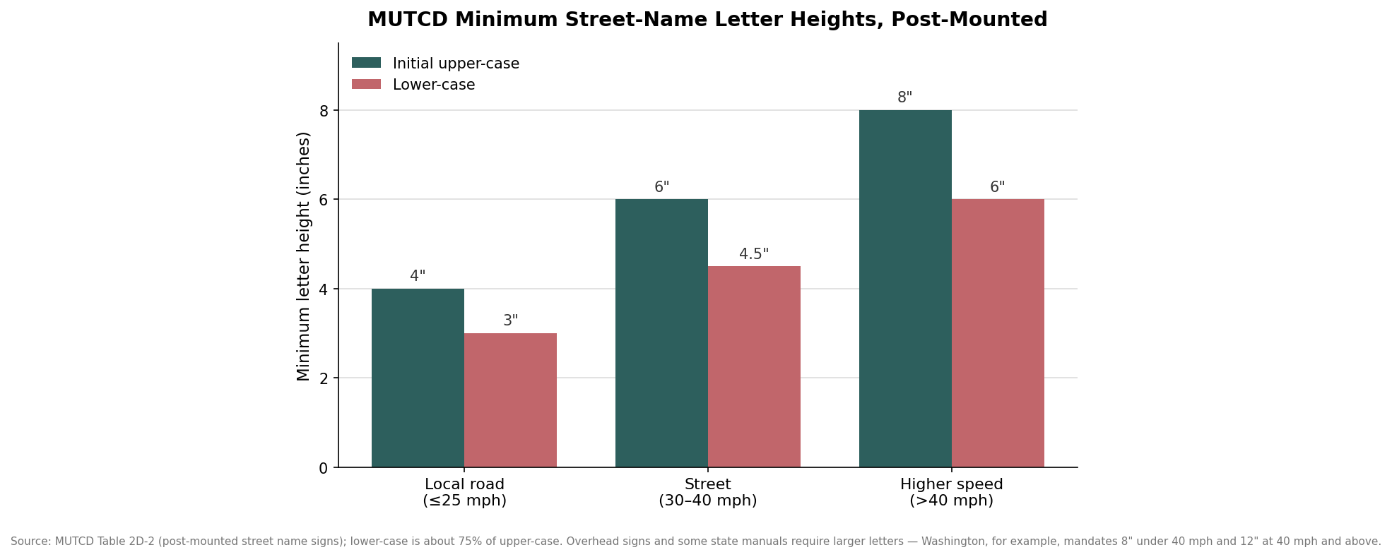
The Manual on Uniform Traffic Control Devices sets minimum letter heights by how fast traffic moves, and those minimums drive the whole sign. For a post-mounted street name sign on a local road with a speed limit of 25 mph or less, the initial upper-case letter must be at least 4 inches tall, with lower-case letters at least 3 inches. On a street posted between 30 and 40 mph, that rises to 6 inches upper-case and 4.5 inches lower-case. Above 40 mph, plan on 8-inch upper-case letters for a post-mounted blade. Lower-case letters run about three-quarters of the upper-case height throughout, and any prefix or suffix such as a directional or the “St” abbreviation can drop to roughly 3-inch upper-case.
Once the letter height is fixed, the blade length falls out of the longest street name you have to fit. A useful planning rule of thumb is roughly 2.5 to 3 inches of blade length per character at a 6-inch letter height, so an eight-character name lands around a 24- to 30-inch blade, and a long name at higher-speed letter sizes can push past 42 inches. Treat that as an estimate for budgeting, then confirm the exact length against your actual worst-case name before you order, because a name that wraps or crowds the ends looks amateurish and reads slower.
Match the sign size to the road, not the budget
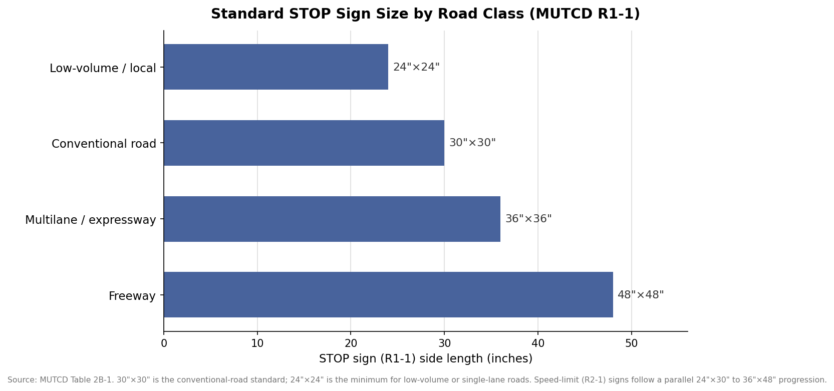
Regulatory signs are sized by the same logic, and the MUTCD publishes a standard size for each road class. A STOP sign, code R1-1, is 30 by 30 inches on a conventional road, which is the size most buyers should default to. It drops to 24 by 24 inches only on low-volume or single-lane roads, and it grows to 36 by 36 inches on multilane roads and expressways, with a 48-inch version for freeway ramps. Speed-limit signs, code R2-1, follow a parallel path from 24 by 30 inches on a conventional road up to 30 by 36 on multilane roads. The temptation is always to buy the smaller, cheaper size, but an undersized regulatory sign is both a legibility problem and a liability problem if a crash review later finds it below standard.
The practical move is to write the road class next to every sign on your order and size to that class, rather than ordering one size for a whole property to simplify the purchase order. A private community with a 15 mph internal speed can legitimately run smaller name blades and 24-inch stop signs, while the same buyer’s entrance off a 45 mph county road needs the larger sizes at that connection.
Pick the aluminum gauge and the sheeting
Street and traffic signs are almost always flat aluminum, and the choice that matters is thickness. The two common gauges are 0.063 inch and 0.080 inch. The heavier 0.080-inch blank is the sensible default for stop signs, larger regulatory signs and any blade longer than about 30 inches, because it resists the flexing and wind flutter that eventually cracks a thinner panel at the bolt holes. Reserve 0.063 inch for smaller, lower-wind signs where you are mounting flat to a wall or a short post. Aluminum does not rust, so the substrate itself will outlast the graphics in nearly every case.
The face is retroreflective sheeting, and the grade you choose sets how bright the sign looks in headlights and how long it lasts. That is a large enough topic that it deserves its own decision rather than a default, and it interacts with the MUTCD’s nighttime visibility requirements, so match the sheeting grade to the road and the expected service life rather than taking whatever a quote lists first.
Set the mounting height and the hardware
A correctly printed sign still fails if it sits at the wrong height. The MUTCD calls for a minimum of 7 feet from the ground to the bottom of the sign in business, commercial and residential areas or anywhere pedestrians and parked cars are present, and a minimum of 5 feet in open rural settings. Where a sign hangs over the roadway, the minimum vertical clearance jumps to 17 feet. A secondary plaque mounted below a primary sign can sit about a foot lower than these figures. Getting this wrong is common on private property, where signs often end up mounted at eye level and are then blocked by the first parked truck.
For posts, a 2 pounds-per-foot U-channel or a square perforated tube handles most street and regulatory signs, set roughly 3 feet into the ground or into a concrete footing in softer soil. On public rights-of-way, breakaway or slip-base posts may be required so the support yields on impact, which is a design question to settle with your engineer before you buy fixed hardware you cannot use.
Put the spec on one line before you order
By the time you send a purchase order, each sign should carry a full specification rather than just a name and a picture: the sign code or street name, the face size in inches tied to the road class, the letter height, the aluminum gauge, the sheeting grade, and the mounting height and post type. Writing it out that way catches the mismatches, an 8-inch letter crammed onto a 24-inch blade, a 0.063-inch stop sign, a 45 mph approach getting a 24-inch sign, while they are still cheap to fix on paper. The numbers here reflect the federal MUTCD as a baseline; individual states publish their own manuals and some set larger minimums, so confirm the current figures for the jurisdiction the sign will stand in, and treat anything installed in a public right-of-way as an engineering decision rather than a catalog pick.